Immaculate Therapy
About the project
Trust isn’t designed. It’s earned. But it starts somewhere, and for Immaculate Therapy, it starts with a brand that feels as safe as it should.
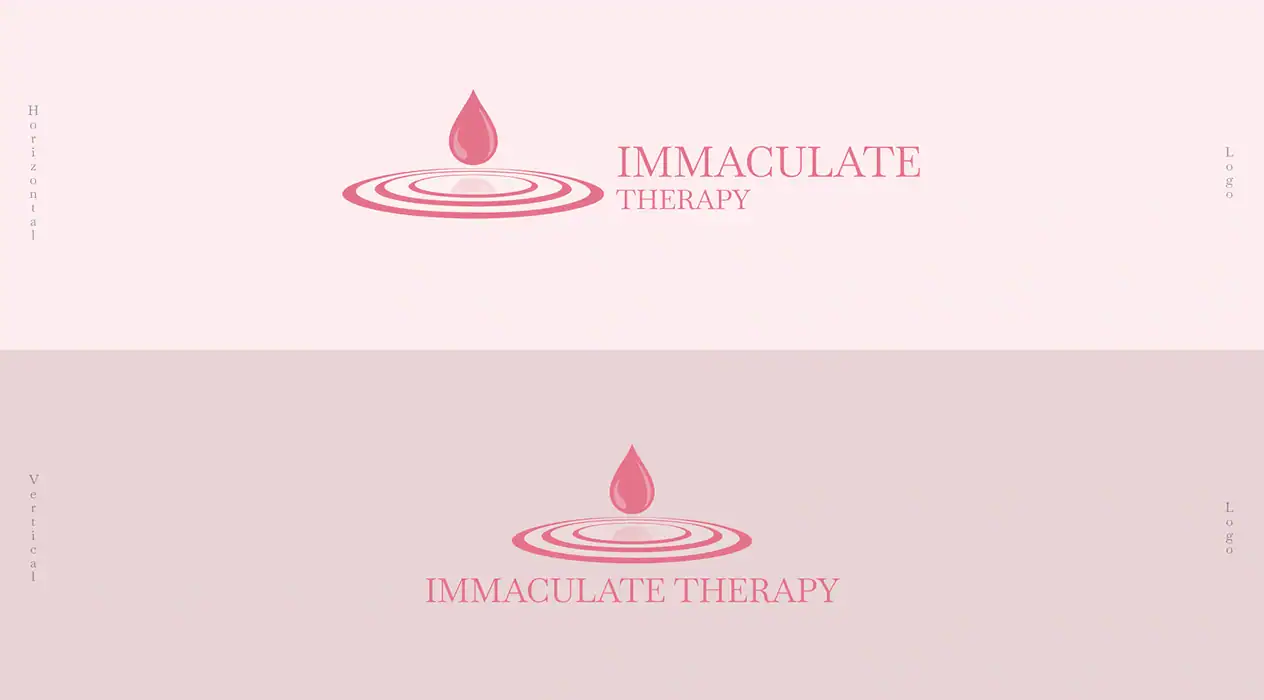
We didn’t just pick colors and fonts. We built a system that translates the invisible work of therapy into something visible and consistent. A logo that signals expertise. A palette that calms without patronizing. Typography that speaks to both the mind and the heart. Graphics that reinforce safety, not sales.
Therapy exists in a strange space: it needs clinical credibility and human warmth. Professional distance and genuine welcome. We threaded that needle across every touchpoint, both digital and physical, and every interaction
The challenge was real. Mental health brands often skew too corporate or too soft. We rejected both. Instead, we created something that feels like an expert who actually listens. A space that’s organized, intentional, and undeniably human.
The result: a brand identity that stands out in a crowded mental health landscape. One that earns trust before a single word is spoken. One that makes clients feel like they’re in exactly the right place.
Design Process